
J. E. Hirsch, D. van der Marel. Incompatibility of published ac magnetic susceptibility of a room temperature superconductor with measured raw data[J]. Matter and Radiation at Extremes, 2022, 7(4): 048401
- Matter and Radiation at Extremes
- Vol. 7, Issue 4, 048401 (2022)
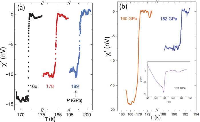
Fig. 1. Ac magnetic susceptibility of CSH at different pressure values reported in (a) Fig. 2a and (b) Extended Data Fig. 7d of Ref. 1 . The inset in (b) shows “raw data” according to Ref. 1 . Reprinted with permission from Snider et al. , Nature 586 , 373 (2020). Copyright 2020 Nature/Springer/Palgrave Nature.
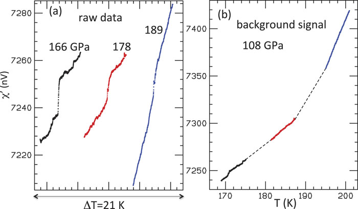
Fig. 2. Raw data from Ref. 2 and background signal calculated from Eq. (2) for the data given in Fig. 1(a) . In (a), the curves have been shifted horizontally and vertically so that they all fit on the same graph, without the scales being changed. In (b), the background signals obtained from Eq. (1) have been shifted vertically to get a smoothly varying slope. This is justified because the data shown in Fig. 1 have all been shifted vertically by an unknown amount so that they are all close to zero above the jump. The dashed lines in (b) have been inserted to guide the eye.
Fig. 3. Magnetic susceptibility for pressures 166, 178, and 189 GPa of Fig. 2a of Ref. 1 . The left panels show the curves with the same resolution as that in the figure published in Ref. 1 , and the right panels show the same curves with higher resolution.
Fig. 4. Magnetic susceptibility for pressures 160 and 182 GPa of Extended Data Fig. 7d of Ref. 1 . The left panels show the curves with the same resolution as that in the figure published in Ref. 1 , and the right panels show the same curves with higher resolution.
Fig. 5. For pressure 166 GPa, the black points are raw data from Ref. 3 , the green curve is susceptibility data from Ref. 3 , and the red points are background signal inferred from the raw data and published data according to Eq. (2) . The lower part of the red curve has been duplicated and shifted down to facilitate comparison of the fine structure.
Fig. 6. For pressure 178 GPa, the black points are raw data from Ref. 3 , the green curve is susceptibility data from Ref. 3 , and the red points are background signal inferred from the raw data and published data according to Eq. (2) . The lower part of the red curve has been duplicated and shifted down to facilitate comparison of the fine structure.
Fig. 7. For pressure 189 GPa, the black points are raw data from Ref. 3 , the green curve is susceptibility data from Ref. 3 , and the red points are background signal inferred from the raw data and published data according to Eq. (2) . The lower part of the red curve has been duplicated and shifted down to facilitate comparison of the fine structure.
Fig. 8. For pressure 160 GPa, the black points are raw data from Ref. 3 , the green curve is susceptibility data from Ref. 3 , and the red points are background signal inferred from the raw data and published data according to Eq. (2) . The lower part of the red curve has been duplicated and shifted down to facilitate comparison of the fine structure.
Fig. 9. For pressure 182 GPa, the black points are raw data from Ref. 3 , the green curve is susceptibility data from Ref. 3 , and the red points are background signal inferred from the raw data and published data according to Eq. (2) . The lower part of the red curve has been duplicated and shifted down to facilitate comparison of the fine structure.
Fig. 10. Susceptibility measurements in diamond anvil cells for (a) yttrium under pressure, from Fig. 1 of Ref. 11 and (b) lead under pressure, from Fig. 3(a) of Ref. 12 . Pressure values are given next to the curves. The rectangular boxes have been inserted to facilitate comparison of the fine structure of different curves in the same temperature range. (a) Reproduced with permission from Hamlin et al. , Phys. Rev. B 73 , 094522 (2006). Copyright 2006 the American Physical Society. (b) Reproduced from Feng et al. , Rev. Sci. Instrum. 85 , 033901 (2014) with the permission of AIP Publishing.
Fig. 11. (a) Susceptibility measurements for (a) platinum hydride under pressure, from Fig. 2 of Ref. 13 , (b) lithium metal under pressure, from Fig. 2 of Ref. 14 , and (c) lutetium metal under pressure, from Fig. 4a of Ref. 15 . The rectangular boxes have been inserted to facilitate comparison of the fine structure of different curves in the same temperature range. (a) Reproduced with permission from Matsuoka et al. , Phys. Rev. B 99 , 144511 (2019). Copyright 2019 the American Physical Society. (b) Reproduced with permission from S. Deemyad and J. S. Schilling, Phys. Rev. Lett. 91 , 167001 (2003). Copyright 2003 the American Physical Society. (c) Reproduced with permission from Debessai et al. , Phys. Rev. Lett. 102 , 197002 (2009). Copyright 2009 the American Physical Society.
Fig. 12. For small temperature intervals for pressures 166 and 189 GPa, respectively, (b) and (d) show data (green points), raw data (black points), and background signal (red points). (a) and (c) show the data with the vertical scale amplified to clearly reveal the fine structure.
Fig. 13. Comparison of fine structure in the raw data (black points) and background signal (red points). The lower red curves are identical to the upper red curves, shifted downward to facilitate comparison with the fine structure in the black curves for temperatures below the drops. The ordinate gives the voltage in nanovolts.
Fig. 14. Comparison of susceptibility increments (in nV) for neighboring points in temperature between raw data (black points) and data (green points). All values have been obtained from the tables in Ref. 3 .
Fig. 15. For pressure 160 GPa, the left panel shows susceptibility increments for raw data (black points) and background signal obtained through Eq. (2) (red points). The right panel shows susceptibility increments for data, i.e., the difference between raw data and background signal shown in the left panel.
Fig. 16. Raw data, data, and background signal inferred by subtraction, obtained from the numerical values reported in Table 5 of Ref. 3 , for the low- and high-temperature regions of the 160 GPa data.
Fig. 17. (a) Susceptibility data (“Superconducting Signal”) for CSH at a pressure 160 GPa, from the numerical data of Table 5 of Ref. 3 . (b) Difference between neighboring points of (a) divided by 0.165 55. (c) and (d) Data of (a) on an enlarged scale. (e)–(g) Data of panels (c), (d), and (a) after unwrapping with integer multiples of 0.165 55. The different colors in (e) and (f) refer to disconnected segments of (c) and (d). (h) Same as (b), but now using the unwrapped data of (g). The same vertical scale is used as in (b).
Fig. 18. (a) Quantized component of susceptibility data (“Superconducting Signal”) for CSH at a pressure 160 GPa. (b) Difference between neighboring points of (a) divided by 0.165 55. (c) and (d) Data of (a) on an enlarged scale.
Fig. 19. (a) Raw data (Measured Voltage) reported in Ref. 3 for 160 GPa (black points), compared with quantized component of susceptibility data (red points). (b) Background signal inferred by subtraction of reported raw data and data in Ref. 3 (black points), compared with background signal inferred from unwrapping of susceptibility data (red points).
Fig. 20. The curves shown in the figure were traced from the curves shown in Fig. 4 of Ref. 2 . The figure caption in that paper reads “The AC susceptibility data of CSH at 138 GPa [1] and elemental Eu at 120 GPa from Debessai et al. [19]. Note that drop in signal in Eu is ∼−40 nV as observed before scaling due to different warming rates.”
Fig. 21. The left panel shows susceptibility results presented in Fig. 2 of Ref. 20 . The regions of the curve corresponding to 118 GPa enclosed in purple rectangles are shown enlarged in the right panel (with lower and higher temperature at the bottom and top, respectively). Note the identical patterns of both curves. Reproduced with permission from Matsuoka et al. , Phys. Rev. B 99 , 144511 (2019). Copyright 2019 the American Physical Society.
Fig. 22. The curves shown here are the same as in Fig. 7 of Ref. 2 , except that the black curve in the top panel is red in that figure and the red line in the top panel is black. The curves were generated using the data in the tables of Ref. 3 . The labels next to the curves are the same as in Ref. 2 . The caption of Fig. 7 of Ref. 2 reads “The AC susceptibility data from Snider et al., showing the raw data, the background used for subtraction and the data shown in the publication.”
Fig. 23. Figure 2 of Ref. 16 , redrawn by us using the data in the tables of Ref. 3 . We reproduce the caption given in Ref. 16 here: “AC susceptibility data. (a) Raw data measured at 160 GPa. The profile of the regions highlighted in blue are used as part of the UDB_1. (b) Measured voltage from the susceptibility measurement explained in experimental details section in Refs. 1 and 2 for 160 GPa. Raw data (red), UDB_1 (blue) and raw data − UDB_1 (black).” (Note that Refs. 1 and 2 in that text are Refs. 1 and 3 in the present paper.
Fig. 24. The content of Fig. 9 of Ref. 16 , redrawn by us. The black curve shows the susceptibility data for 160 GPa. The green and magenta curves show the “unwrapped curve” and “quantized component” following the procedure described in Ref. 16 . The dark blue and red curves show the corresponding quantities in our procedure. The figure is identical to Fig. 9 of Ref. 16 .
Fig. 25. Unwrapped curve and its derivative obtained with the rounding-off procedure of Ref. 16 . Note the discontinuities in the slope, encircled in red.
Fig. 26. First derivative of the unwrapped curve using as “arbitrary factor” 0.18 instead of 0.165 55.


Set citation alerts for the article
Please enter your email address

© Copyright 2018-2021 | Chinese Laser Press. All Rights Reserved 沪ICP备15018463号-20