
Xue-Jin Fang, Jun-Ying Cui, Dan-Dan Hu, Xiao-Pu Han. Relativistic regional innovation index and novel business cycle [J]. Acta Physica Sinica, 2020, 69(8): 088905-1
- Acta Physica Sinica
- Vol. 69, Issue 8, 088905-1 (2020)
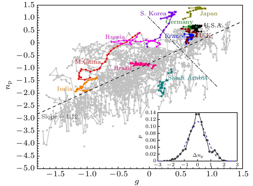
Fig. 1. The trajectories of economies from 1985 to 2017 in the space of the logarithmic relative GDP per capita (g ) and the logarithmic relative number of patent applications per capita (n p). The colored curves and gray curves represent the trajectory of 11 representative economies and the remain economies, respectively. The gray dashed line is the fitting function n p = 1.12g – 0.82 of all data points. The gray dot dash line roughly distinguishes between the developed economies and the developing economies. Developed economies are mainly in the upper right area, while developing economies are in the lower left. The inset plots the distribution of the deviation Δn p of each data point from the fitting line, in which the blue dashed line is its Gaussian fitting.
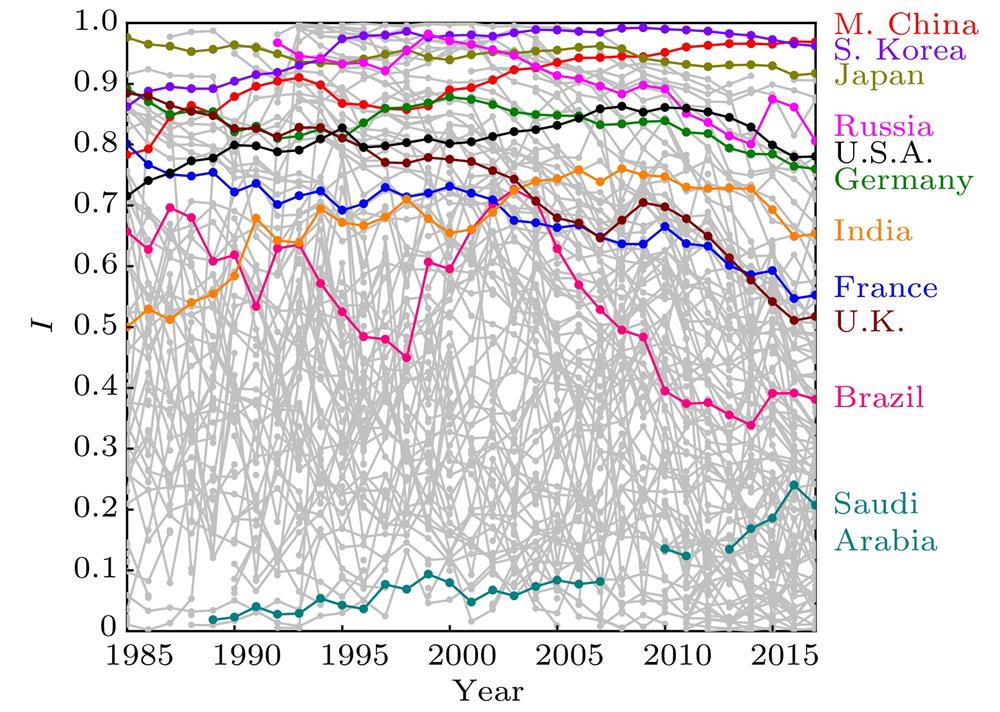
Fig. 2. The change of the regional innovation index I of each economy with the years. The colored curves and gray curves represent 11 representative economies and the remain economies, respectively.
Fig. 3. The regional innovation index I vs. global innovation index (GII) for each economy at 2016. The color of each data point shows the logarithmic relative GDP per capita (g ) of each economy.
Fig. 4. The correlations between the average regional innovation index of each country
 and the average growth rate of relative per capita GDP
 in the period from 1998 to 2017: (a)
 \begin{document}$ Z=\left\langle {I} \right\rangle^{\beta} $\end{document} ![]()
![]()
β = 3.80 corresponding to the strongest correlation between
 and
and Z , and the dashed line is the fitting line. The inset of panel (a) shows the correlation between
 and
and
 (setting
 β = 1.0); (b) the correlation between
 and the corrected prediction value
 Z f of each economy, where
 ,
,
 is the 20-year average of the logarithmic relative GDP per capita
 g of each economy, and β = 3.80, a = -0.011, b = –0.020, c = 0.0013, and k = 0.033 is the slope of the fitting line in Fig.(a). The dashed line in the inset of Fig. (b) shows the correction function
 , which is obtained by the fitting for the correlation between
 ε and
 , where
 ε is the regression residuals in the linear regression shown in Fig. (a)
and the average growth rate of relative per capita GDP
in the period from 1998 to 2017: (a) and and
(setting and the corrected prediction value ,
is the 20-year average of the logarithmic relative GDP per capita , which is obtained by the fitting for the correlation between , where Fig. 5. Designing the moving window length of 1 year, 3 years and 5 years, for given index, the correlation between the average value of the index of each economy and the average growth rate
 of the relative GDP per capita within the moving window are shown by curves and data points. The black, blue and pink lines and hollow data points show correlation
 r I , corresponding to the index I . The different gray dashed lines show the thresholds of the correlation r I for different level of significance in the case with the minimum data points (corresponding to the case with 1-year moving window length), and the light gray, medium gray and dark gray dashed lines correspond to the significance P = 0.05, 0.01 and 0.001, respectively. The dark yellow, dark cyan, magenta dashed lines and solid data points show correlation r GII, corresponding to global innovation index (GII). The olive dashed line and hollow data points show correlation r p, corresponding to the index of the logarithmic relative number of patent applications per capita (n p) (5-year-moving-window only). The inset shows the correlations between
 and
and r I , and the correlation beween
 and
and r p, where
 and
and
 is the average growth rate of the relative GDP per capita within the moving window for high-income economies and all economies, respectively, and the solid lines respectively are the fitting curve for the data points with the same color.
of the relative GDP per capita within the moving window are shown by curves and data points. The black, blue and pink lines and hollow data points show correlation and and and
is the average growth rate of the relative GDP per capita within the moving window for high-income economies and all economies, respectively, and the solid lines respectively are the fitting curve for the data points with the same color. Fig. 6. (a) and (b) respectively compare the correlations between the average value of the index I of each economy
 and the average growth rate
 of the relative GDP per capita at the 5-year moving windows before and after the transition from bottom on
 r I wave to peak and the one from peak to bottom. Fig. (a) shows the comparison between 1994 (the cyan hexagons, at the bottom) and 2004 (the pink dots, at the peak), where the data points of the same economy are connected by gray lines, and the green dashed line and the pink dashed line respectively show the linear fittings of 1994 (with a slope of –0.050) and the one of 2004 (with a slope of 0.073); Fig. (b) shows the comparison between 2004 (the pink circles, at the peak) and 2014 (the blue dots, at the valley), where the data points of the same economy are connected by gray lines, and the pink dashed line (with a slope 0.073) and the blue dashed line (with a slope of –0.033) show the linear fittings of 2004 and 2014, respectively; Panel (c) plots the relationship between the change
 in the valley-peak transition and the change
 in the peak-valley transition, where the diameter of each circle is proportional to the 20 year average
 of the economy’s index, and the color corresponds to the 20-year average growth rate
 of the economy’s relative GDP per capita.
and the average growth rate
of the relative GDP per capita at the 5-year moving windows before and after the transition from bottom on in the valley-peak transition and the change
in the peak-valley transition, where the diameter of each circle is proportional to the 20 year average
of the economy’s index, and the color corresponds to the 20-year average growth rate
of the economy’s relative GDP per capita. 
Set citation alerts for the article
Please enter your email address
© Copyright 2018-2021 | Chinese Laser Press. All Rights Reserved 沪ICP备15018463号-20